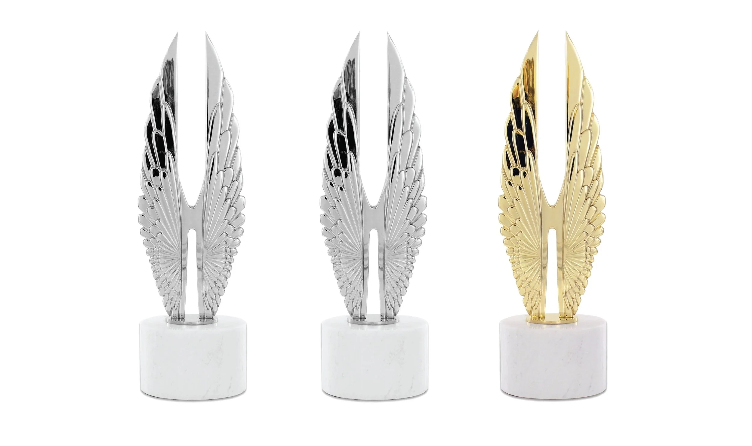
We are so honored and excited to share that Riley Group, Inc. has received three Hermes Creative Awards for our recent work with Starwood Retail Partners and Boot Barn! This is one of the largest international competitions around, designed to honor the messengers and creators of traditional and emerging media.
Here’s what our team of fantastic creatives and wonderful clients brought home:


PLATINUM: Customer Experience Initiative, Live 360° for Starwood Retail Partners
We received a Platinum award, the highest honor, for a Customer Experience Initiative for our work on Starwood Retail Partners’ Live 360° programming.
We created Live 360° to bring a true sense of community back to Starwood’s malls. We elevated great malls to spaces where authentic, local experiences happen. We packed each property with activities that connected visitors to their neighbors, passions and ideas. In 2018, we launched the program at 28 locations, while facilitating meaningful guest engagement through teen art salons, cooking classes, eco-friendly fashion shows and more.
Read more about our Live 360° programming here.


PLATINUM: Internal Communication Campaign, SHED: Live 360° for Starwood Retail Partners
We received a prestigious Platinum Hermes Creative Award for an Internal Communication Campaign for SHED: Live 360°, an employees-only experience for our client, Starwood Retail Partners.
Our SHED program showed employees how exhilarating trends like wellness, technology and conscious brands really are. SHED demonstrated that the future isn’t so much about physical space, but about making room for ideas that resonate with our guests, our communities and the world.
See a recap of our SHED experience here.


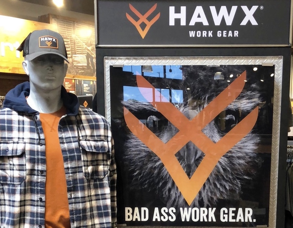
GOLD: Logo, HAWX Work Gear for Boot Barn
Riley Group, Inc. received a coveted Gold Hermes Creative Award for the design of a logo created for HAWX, Boot Barn’s line of work gear.
HAWX, a brand built to compete with companies like Timberland, Carhart and Ariat, needed a logo that stood out and made an impression. This “badass” logo, which cleverly combines both the “X” in HAWX and the bird’s beak, was specifically designed to appeal to male workers. Its smoldering orange insignia looks freshly branded, a nod to the get-your-hands-dirty work our target consumers do every day.
Learn more about our HAWX creative process in this case study.

