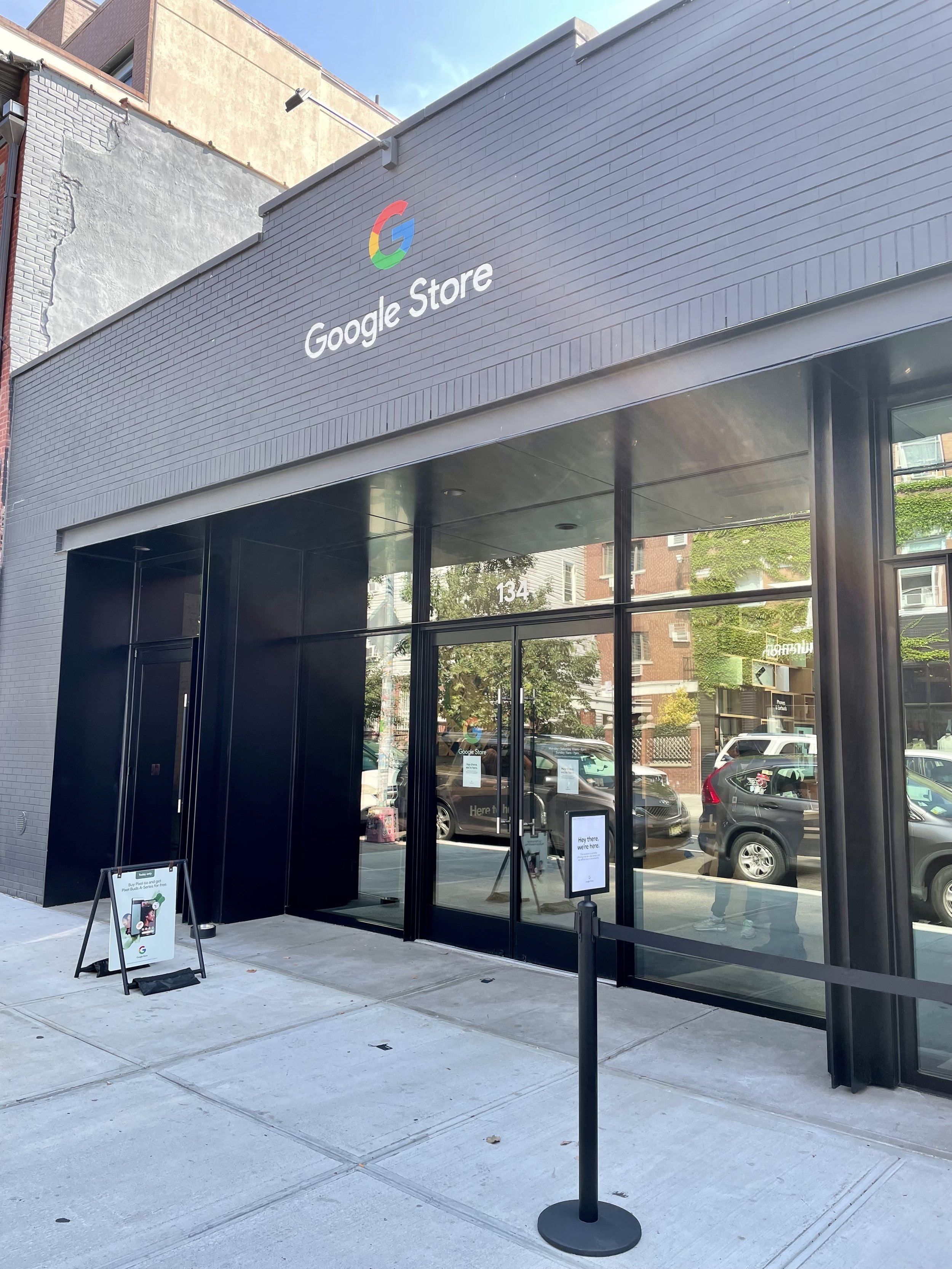
A little more than a year after opening its flagship store in Chelsea, Google introduced its second retail location in Brooklyn’s shopping hub, Williamsburg.
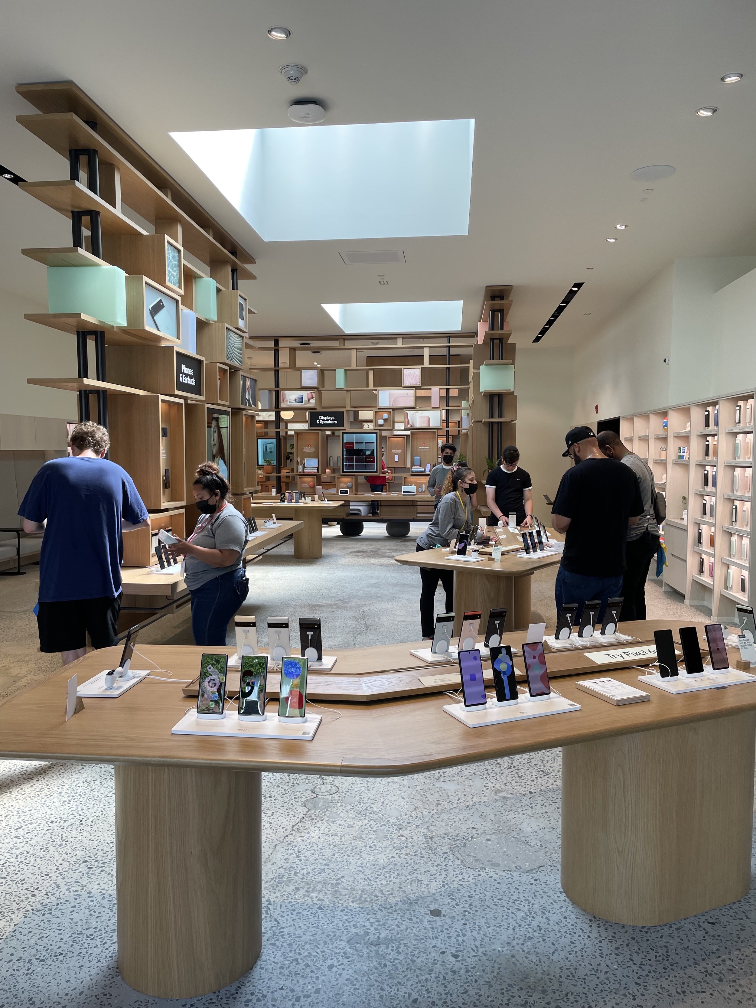
Google’s first “neighborhood” brick-and-mortar store aims to represent the future of tech-related retail. The store's bright, sleek, and airy design feels friendly but uniform, with design nods appealing to the surrounding neighborhood’s style.
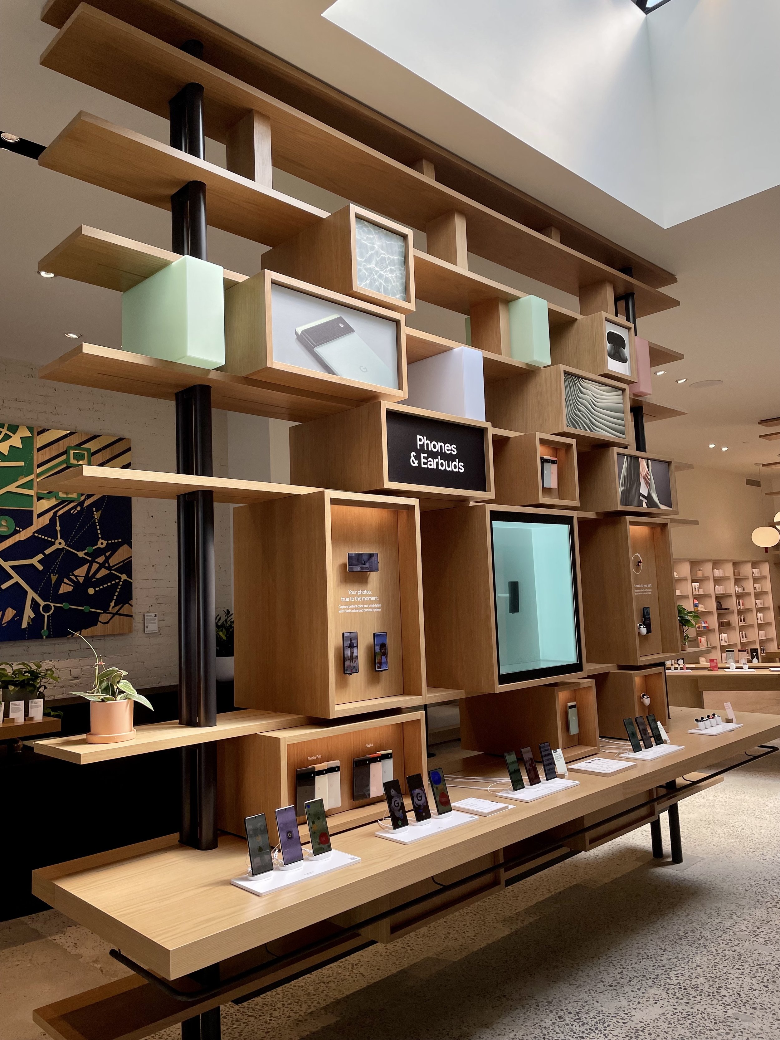
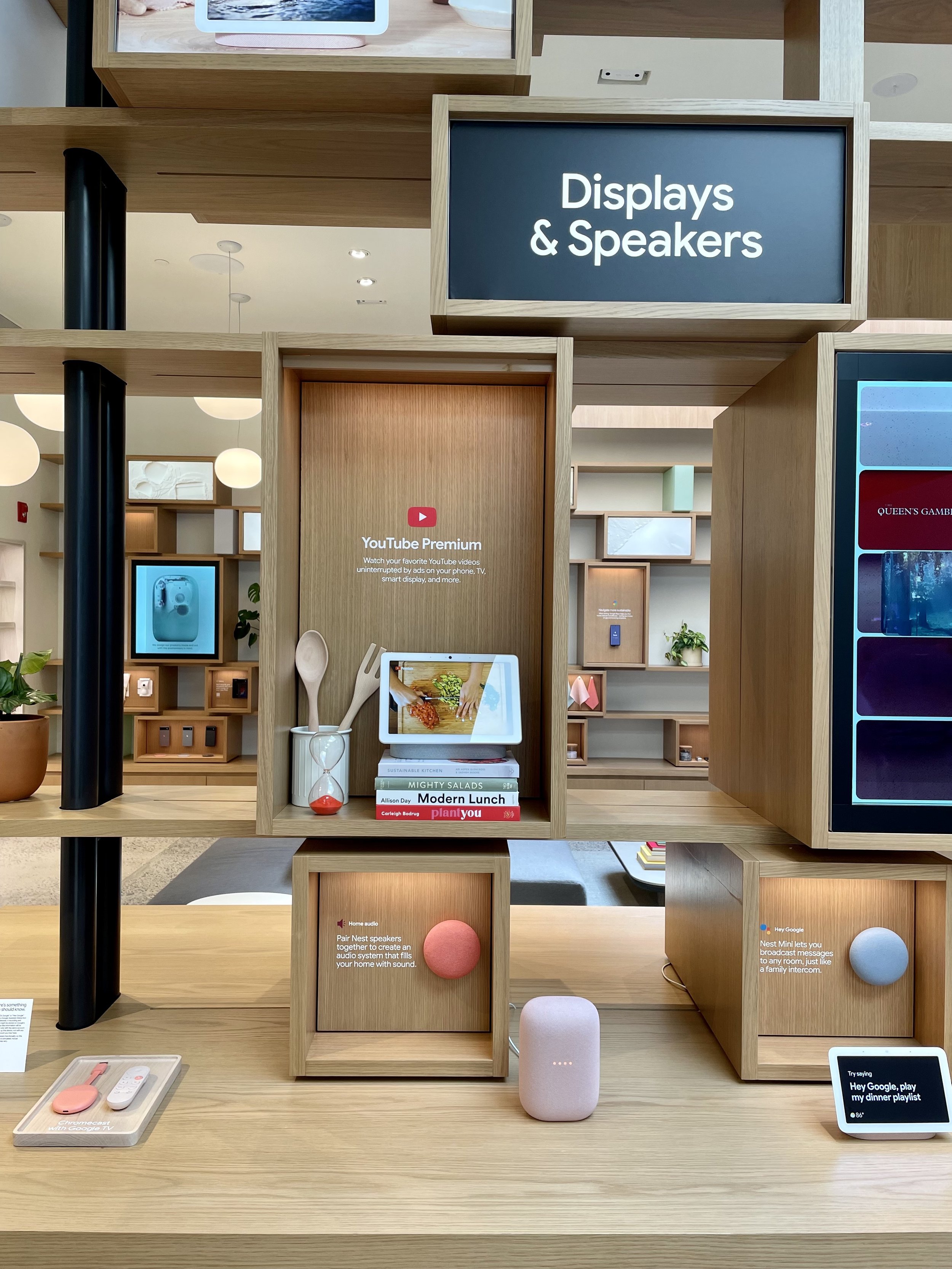
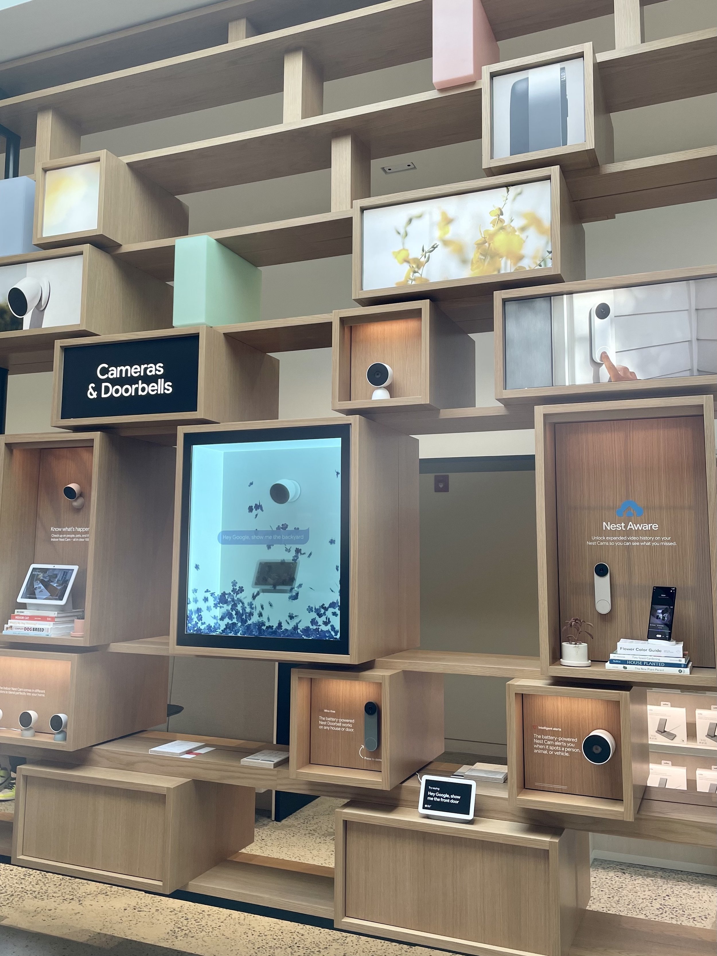
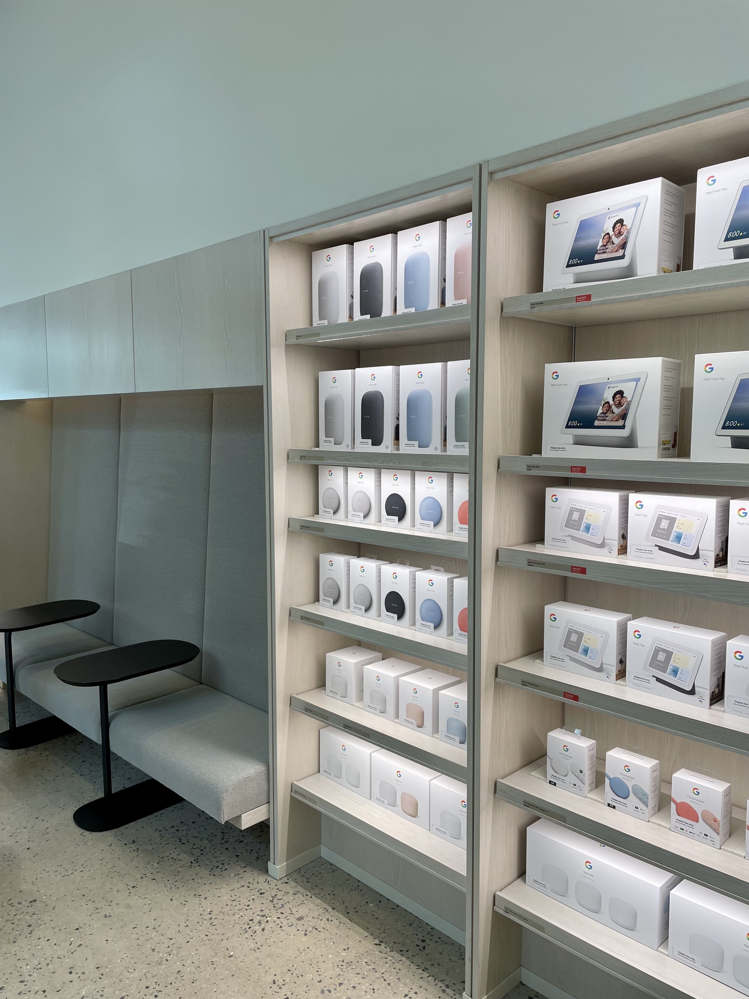
Compared to other tech giants’ locations (cough cough Apple, Amazon), the Google store offers a more inviting and intimate environment for customers to get a hands-on experience with their catalog of products. Featuring an array of the Nest collection, their Pixel 6 pro, and more, colorful interactive displays throughout the space creatively showcase how their products and services work together.
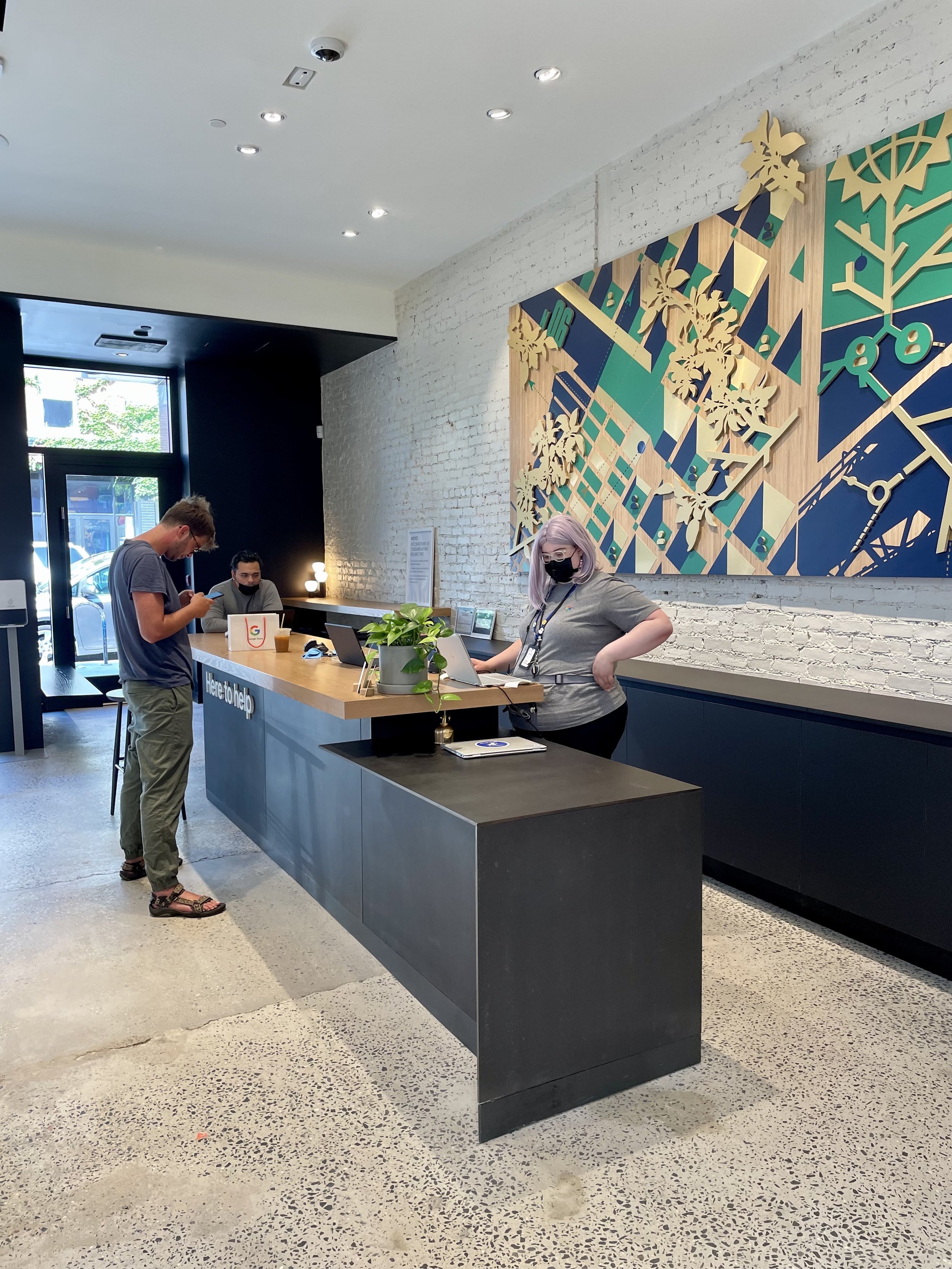
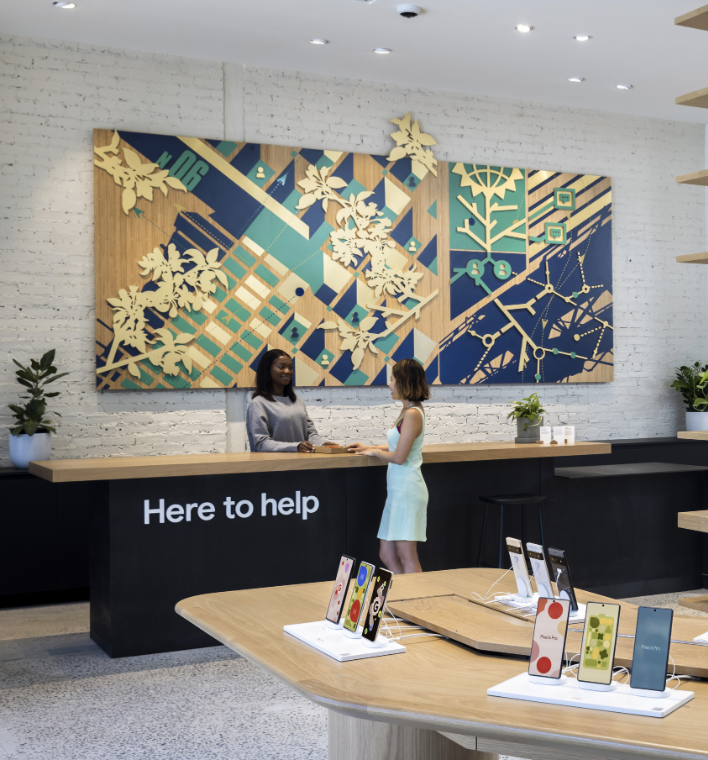
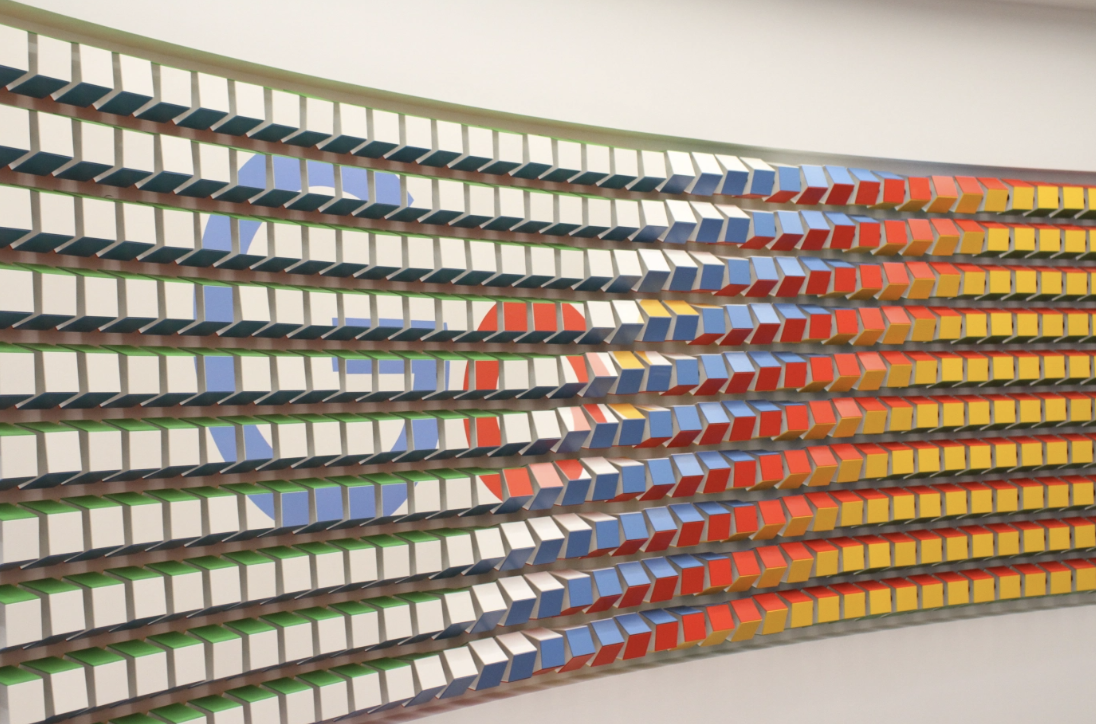
The store’s color palette takes a softer turn away from Google’s primary colored branding and inserts a pop of color with an installation by Brooklyn-based artist Olalekan Jeyifous. The abstract piece framed behind the help desk “explores the relationships between architecture, community, and the environment.”
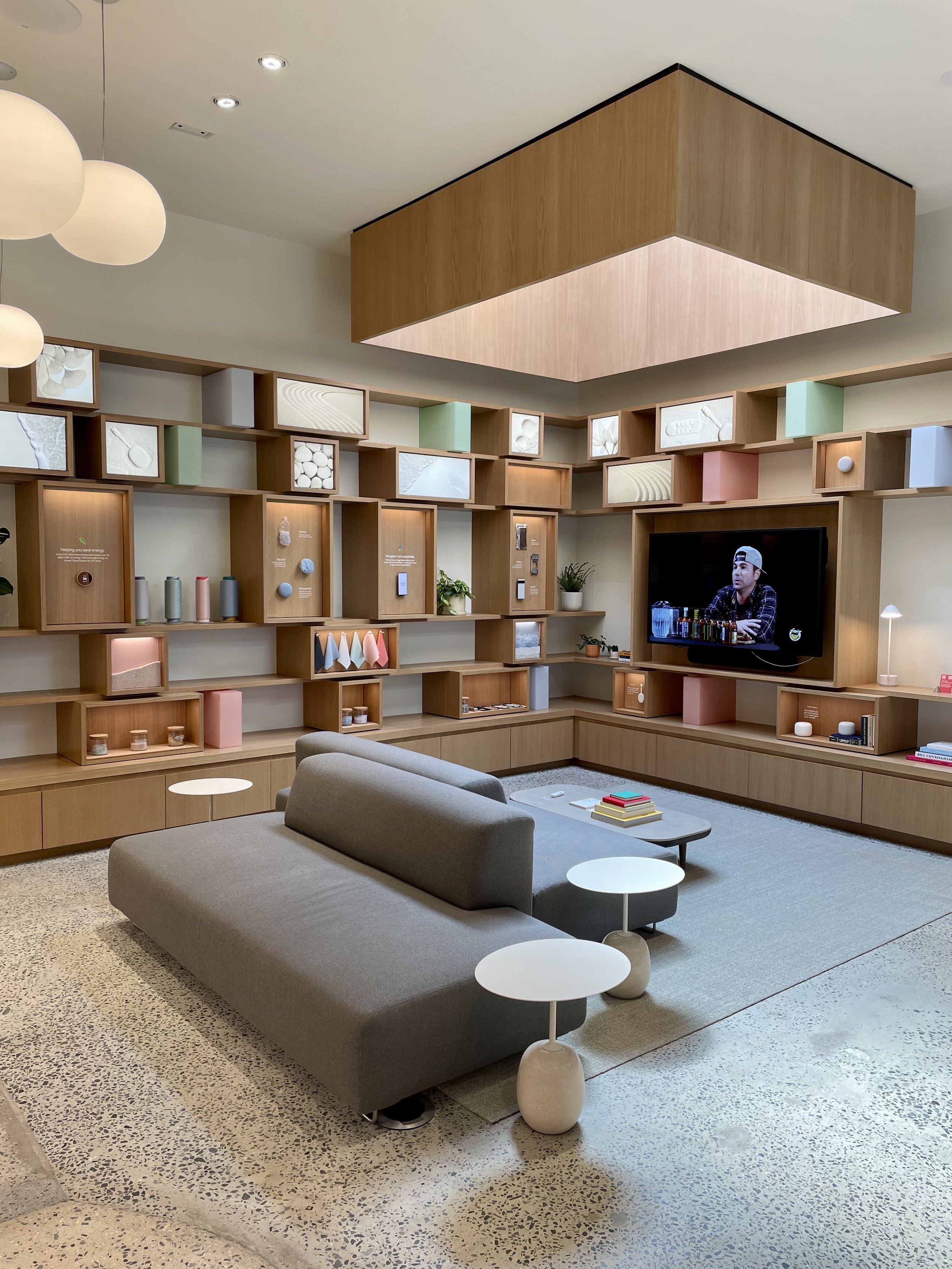
Google’s Williamsburg location also includes a cozy setup at the back for shoppers to imagine how google products could fit in their homes. With more seating along the edges of the perimeter and coffee tables, the space feels inviting to relax, mingle with the employees, troubleshoot issues, or discuss a purchase in a more hospitable setting than we’re used to seeing for tech retailers. (Re: most vendors want to get you in and out with a conversion rather than having customers hang around after a purchase).
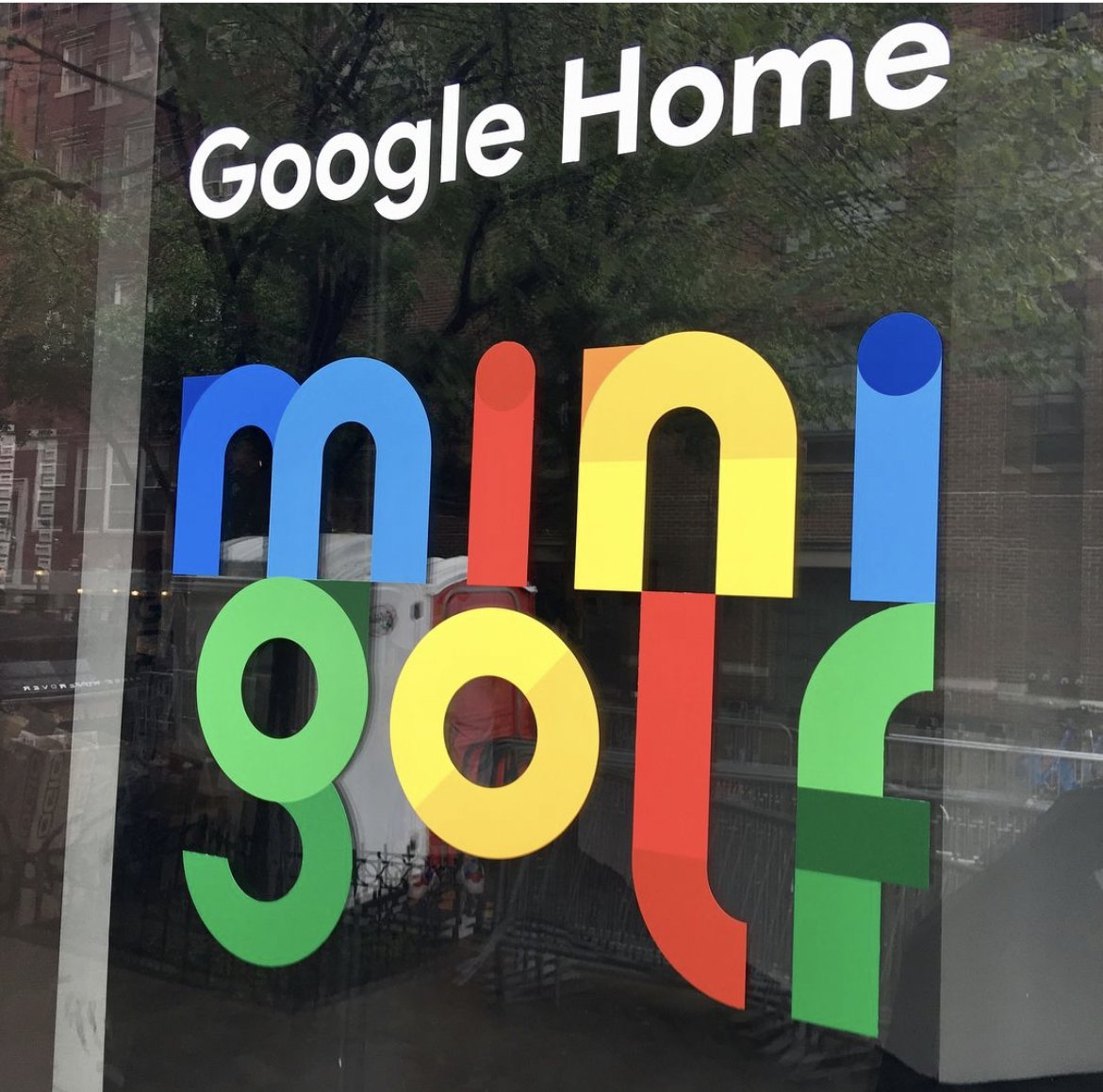
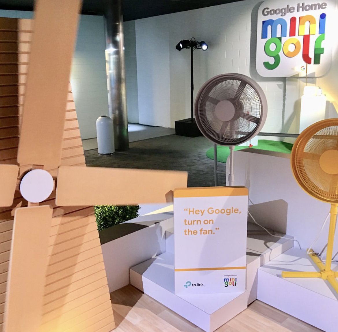
Like Amazon, Google has explored brick-and-mortar pop-ups in the past while experimenting with the customer journey and design. For example, there was a Soho Pop-up shop in 2016 & mini golf pop-up we covered in 2018, to name a few.
From their past trials, Google's store designers abandoned their harsher tones and began providing a landscape focused more on one-on-one selling for a slower, quieter transaction, putting quality of experience above turnover rate.
We were surprised within this breezy setting that they didn’t include more amenities to entice non-purchasers to explore (i.e., a cafe, snack offering, product demos). However, the focus of this space is to bring awareness to its inventory for customers not entirely interested in Google products.
With the opening of its first neighborhood location in Brooklyn, Google is looking to push for more long-term branded retail experiences. So look out for a Google neighborhood store popping up near you.
#HumanCenteredDesign #HCD #HumanExperienceDesign #HXD #CX #consumerexperience #DEFIANTLYHUMAN™ #DesignResearch #trends #globaltrends #journeymapping #customerjourney #customerjourneydesign #customerexperience


