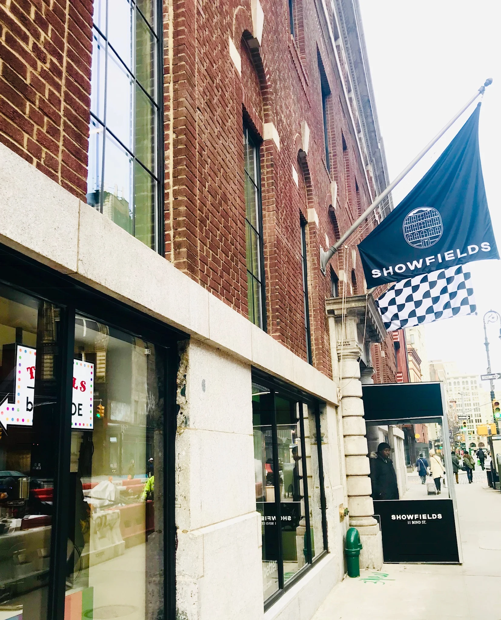
Showfields is a new retail concept that boldly totes itself as “The most interesting store in the world”. Somewhere in between a pop up exhibition space and permanent mall, this ambitious venture has the potential to be the paragon of brick and mortar retail.
Opened earlier this winter, Showfields on Bond Street, from the outside looks like classic department store. Yet, the Georgian exterior is the only ordinary component to the space. Inside a labyrinth of booths and halls houses 8 semi permanent vendors, a rotating influencer space and a by CHLOE. “test lab”. Each booth acts as a temporary flagship for direct to consumer brands. WIth limited leases of 3-6 months, it allows flexibility for e-commerce based companies to get used to merchandising their products in store and finding new customers offline.
Eventually the rest of the floors will lend themselves to design and co-working spaces but as of now only one of four floors is currently open to the public, showcasing the booths of the wellness and self care minded startups. The ground floor also including a month long rotating shop curated of “influencer” approved products.
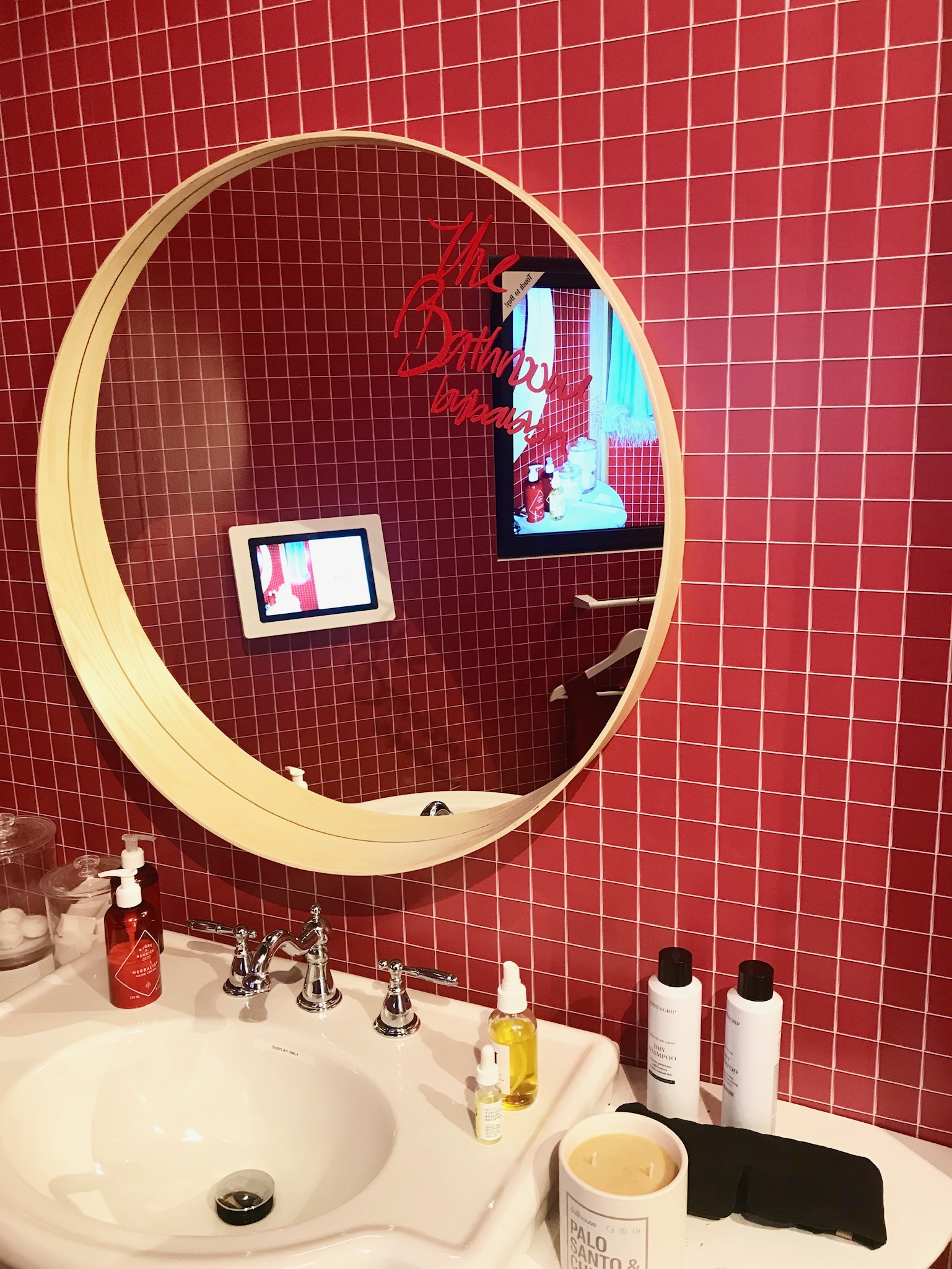
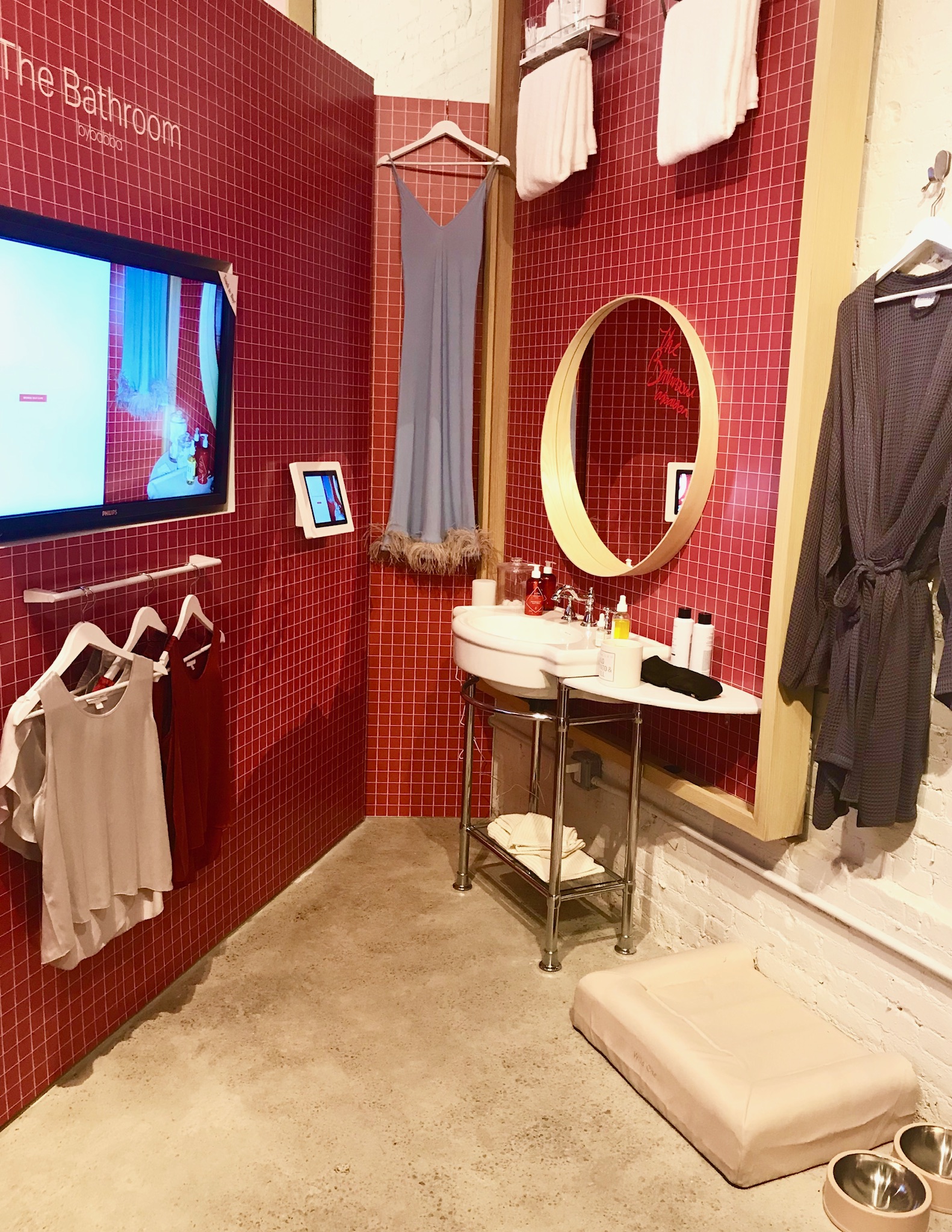
This month the influencer Babba C Riviera, provided The Bathroom by Babba. Babba runs a next gen brand marketing agency and designed a shoppable bathroom space that focuses on products that promote self care, discovery and modern sustainability. With her take on retail - she’s created her own mini Showfields - including other ecommerce fronted brands like Lunya, Tata Harper and Herb Essntls. This tastemaker created space is a mutually beneficial concept, it drives social media followers into a brick and mortar space at the same time introducing the influencers brand to new consumers irl.
While Showfields lends the space, it is up to the vendors to create a successful experience. The snapshot flagship must be eye catching, interactive and speak for itself. Showfields associates move between booths for broad questions or concerns, but without designated reps at every station some brands were more impactful than others.
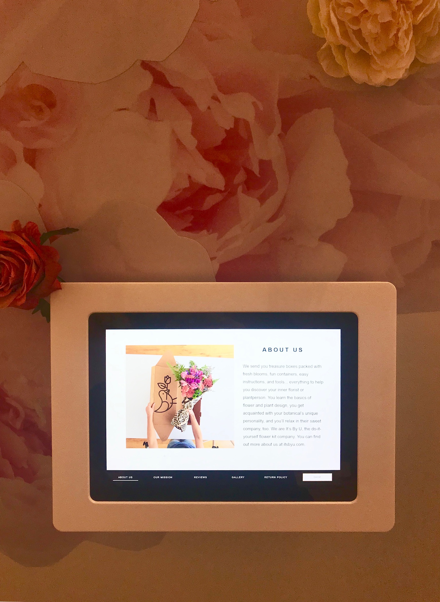
Plaques outside each booth and iPad’s inside replace the need for in person sales associates. You can subscribe and purchase product without any human interaction.
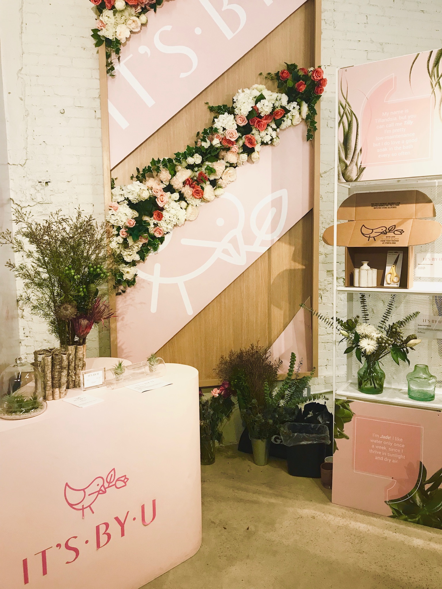
It’s By U is a subscription based flower shop that ships you how-to-boxes to create floral arrangements - sourced from eco friendly farms in the U.S., Mexico and Ecuador. Each boxed arrangement teaches the consumer about good farming practices and a portion of the sales goes to a charity that up-cycles flowers, distributing them to patients in hospitals and nursing homes. This was the first booth that I entered, attracted by the interior floral display and its straightforward messaging of at home created arrangements.
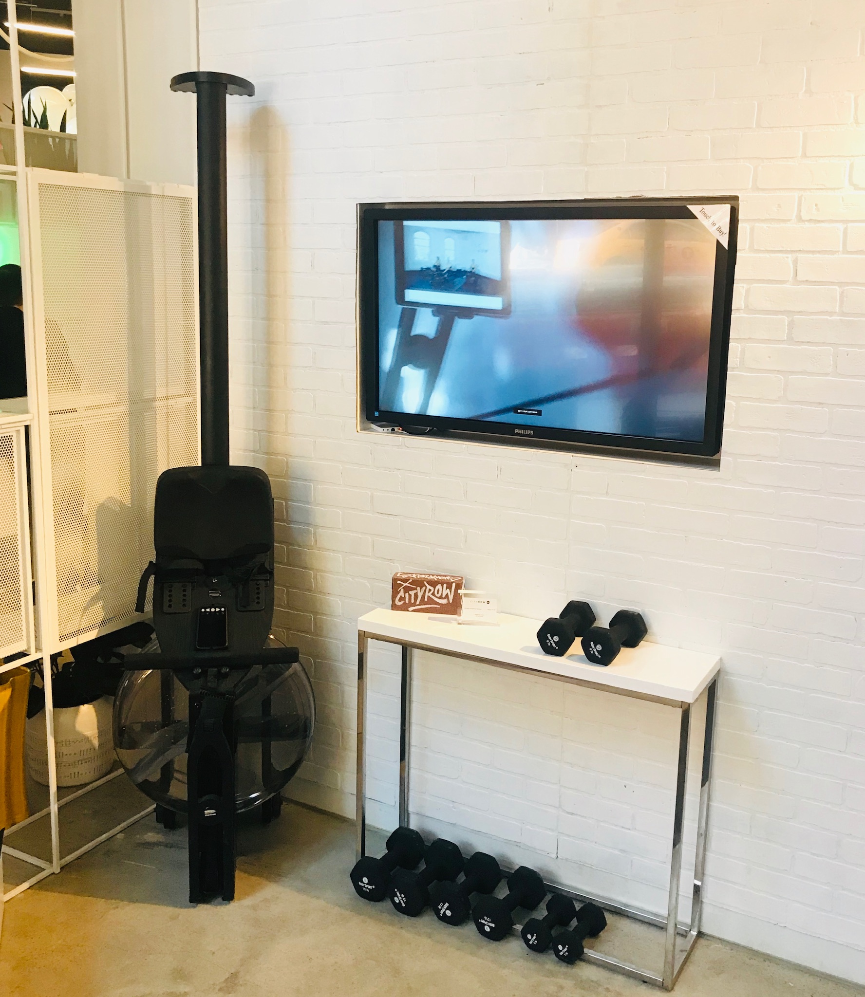
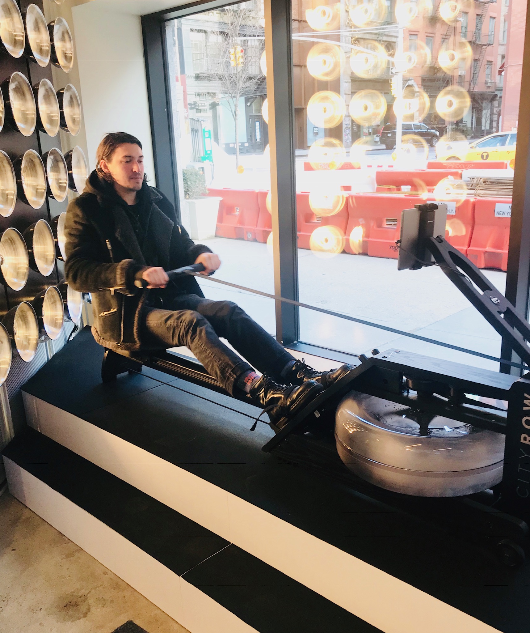
City Row is a wellness brand focused on a water rower machine. With on demand classes, two locations in NYC, City Row the new trendy cardio alternative. There was not much to this display, nor did there need to be, other than a machine to test and instructive videos on a loop.
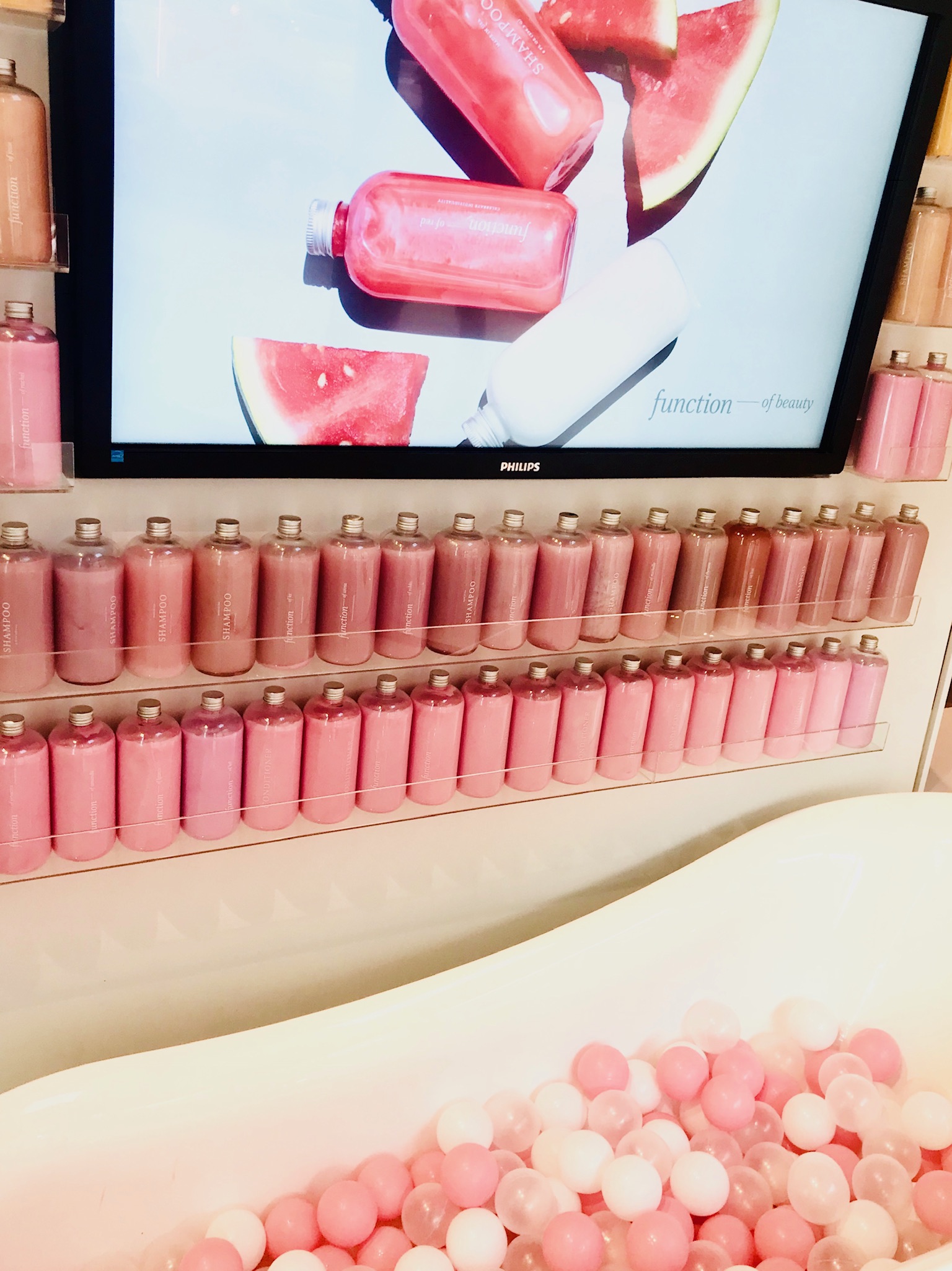
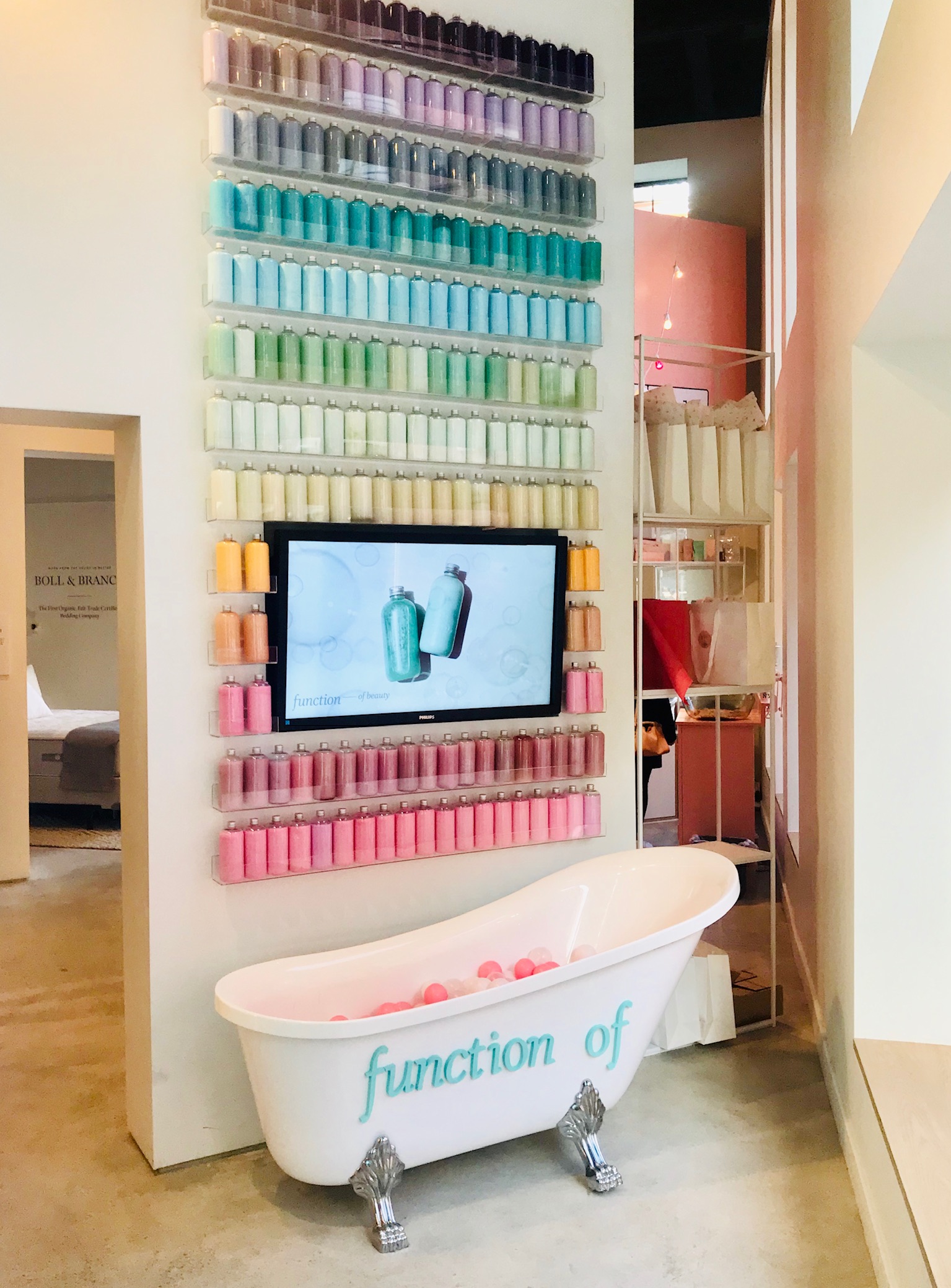
Function of, is a personalized hair care company focused on the consumer's hair type and how to reach their “hair goals”. You can take their quiz to customize everything from hair texture, goal length to fragrance strength. The space is designed like an instagrammable pop-up with a bubble bath and gradient product wall, perfect for a selfie.
While designing spaces specifically to be shared on social media is an important strategy, the space needs to tell the story of the brand other than look “worthy of the gram”.
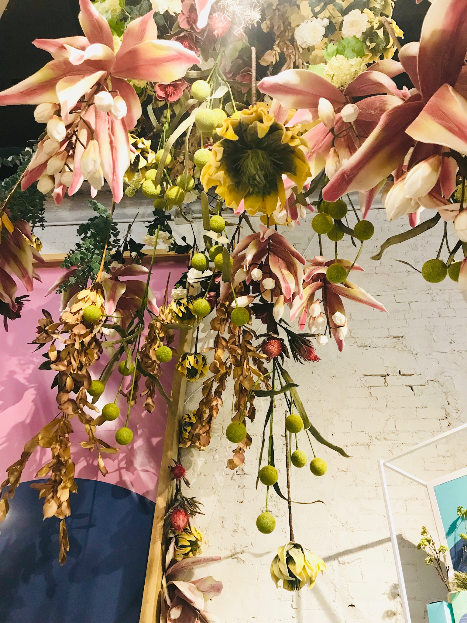
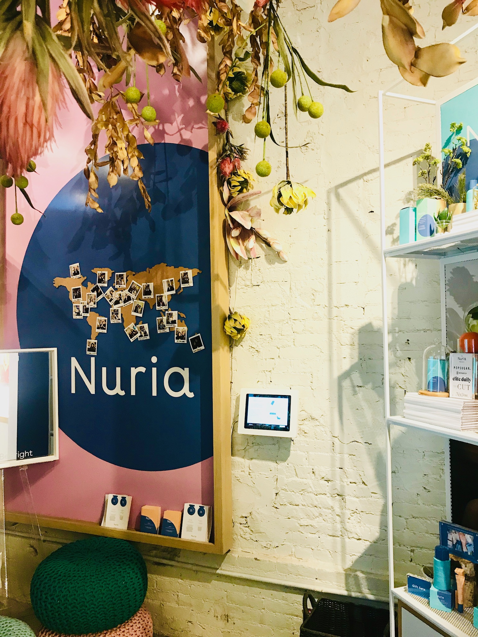
Nuria an all natural plant based skincare brand, stood out immediately because of its lush overflow of foliage. When I stepped into the booth I was immediately instructed by a Showfields employees the best angle for a selfie. What wasn't evident besides the fact that the brand wanted to make you look good, was their dedication to charity. Only after researching did I find that a percentage of Nuria’s sales are donated to “She’s the FIrst” - a non profit organization that fights gender inequality through education for young women around the world. Social justice forward campaigns can only increase brand clout among young consumers, therefore a missed opportunity.
The booths that were most successful had readily available samples. Without seeing the product in person, you might as well be shopping online.
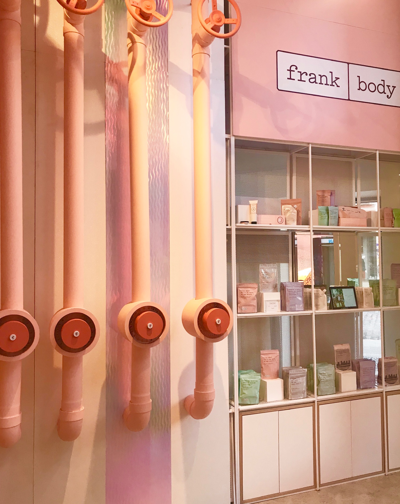
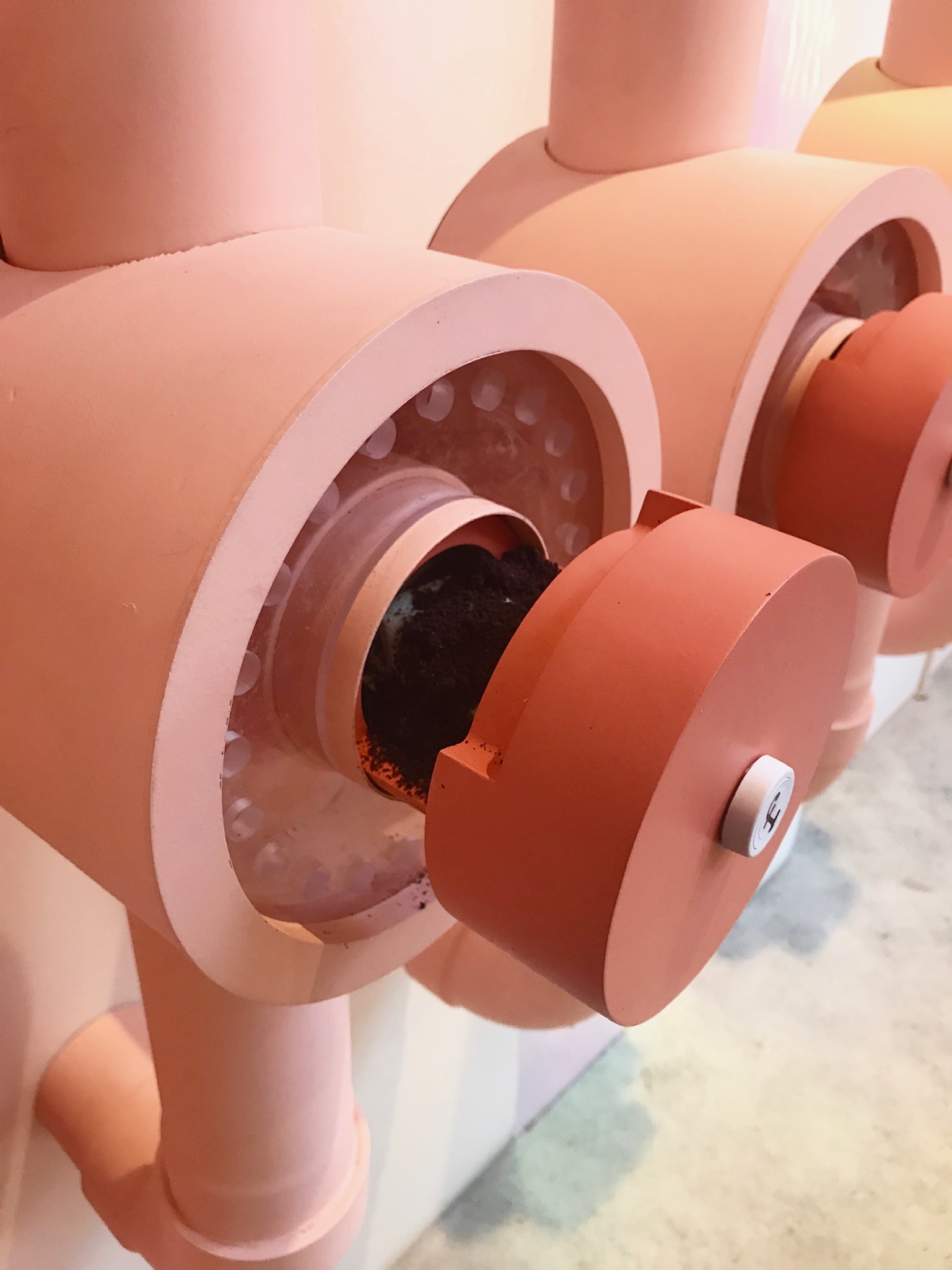
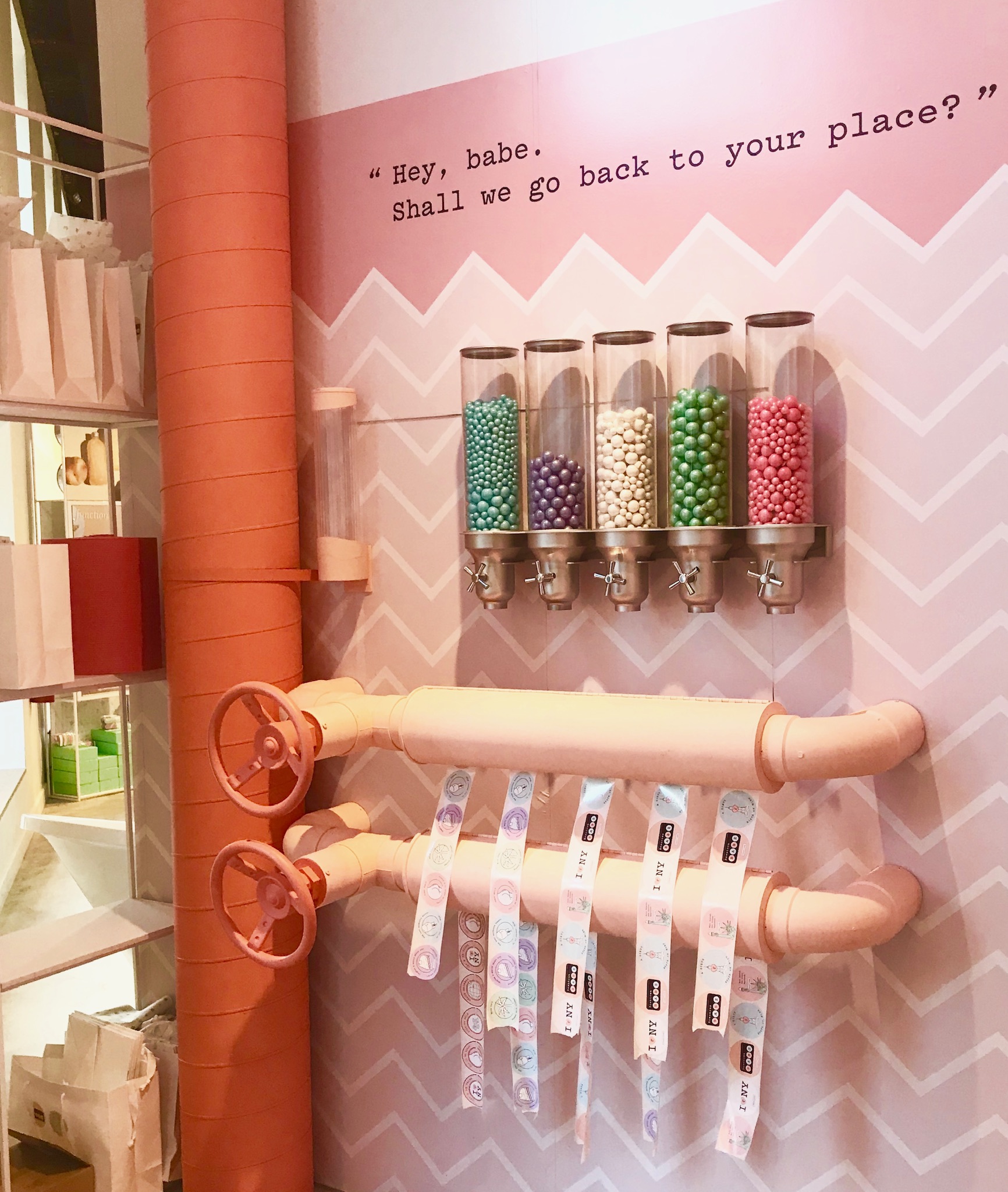
Frank Body was one of the first instagram sponsored brands approved and featured by nearly every beauty blogger and celebrity. It’s a female focused body and facial scrub made famous by their original coffee scrub. The mini flagship is colorful, stocked with products, coffee filled working grinders, and a sink station to test the scrubs. It’s concise, well decorated, and interactive for the unfamiliar.
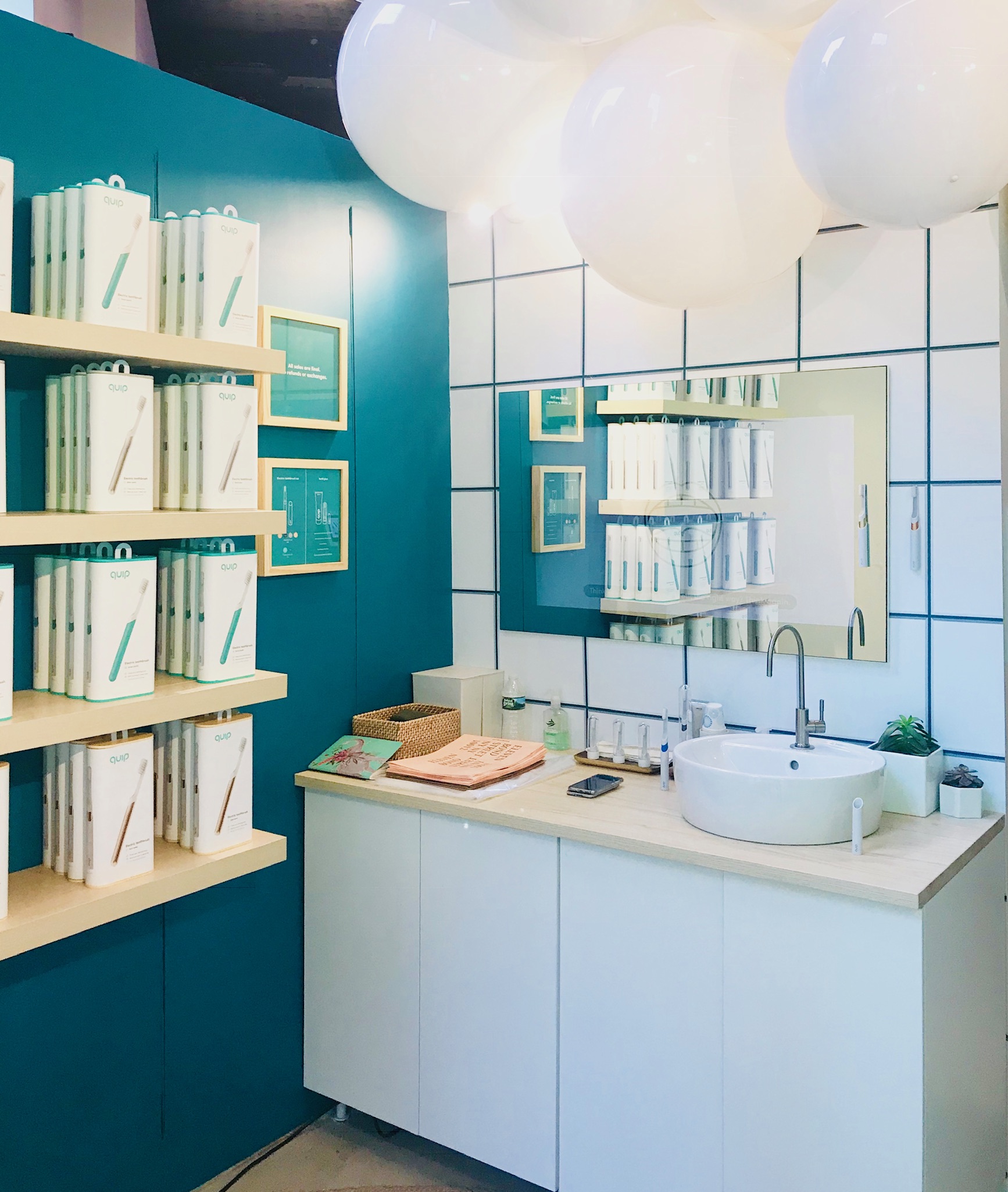
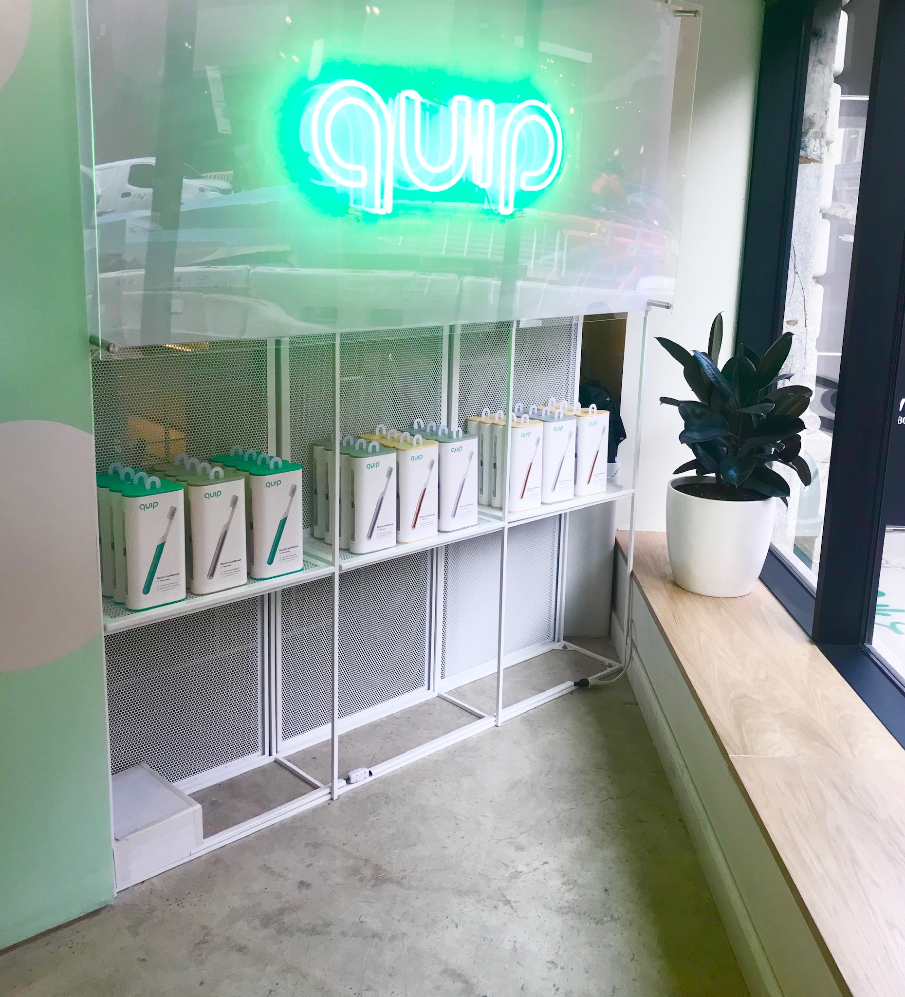
Quip is an electric toothbrush company for the modern age. Designed to deliver simple ways to keep your mouth clean. The space is as straightforward as their ads. A sink, some toothpaste and some testers. If impressed you can sign up for a subscription of brush head refills.
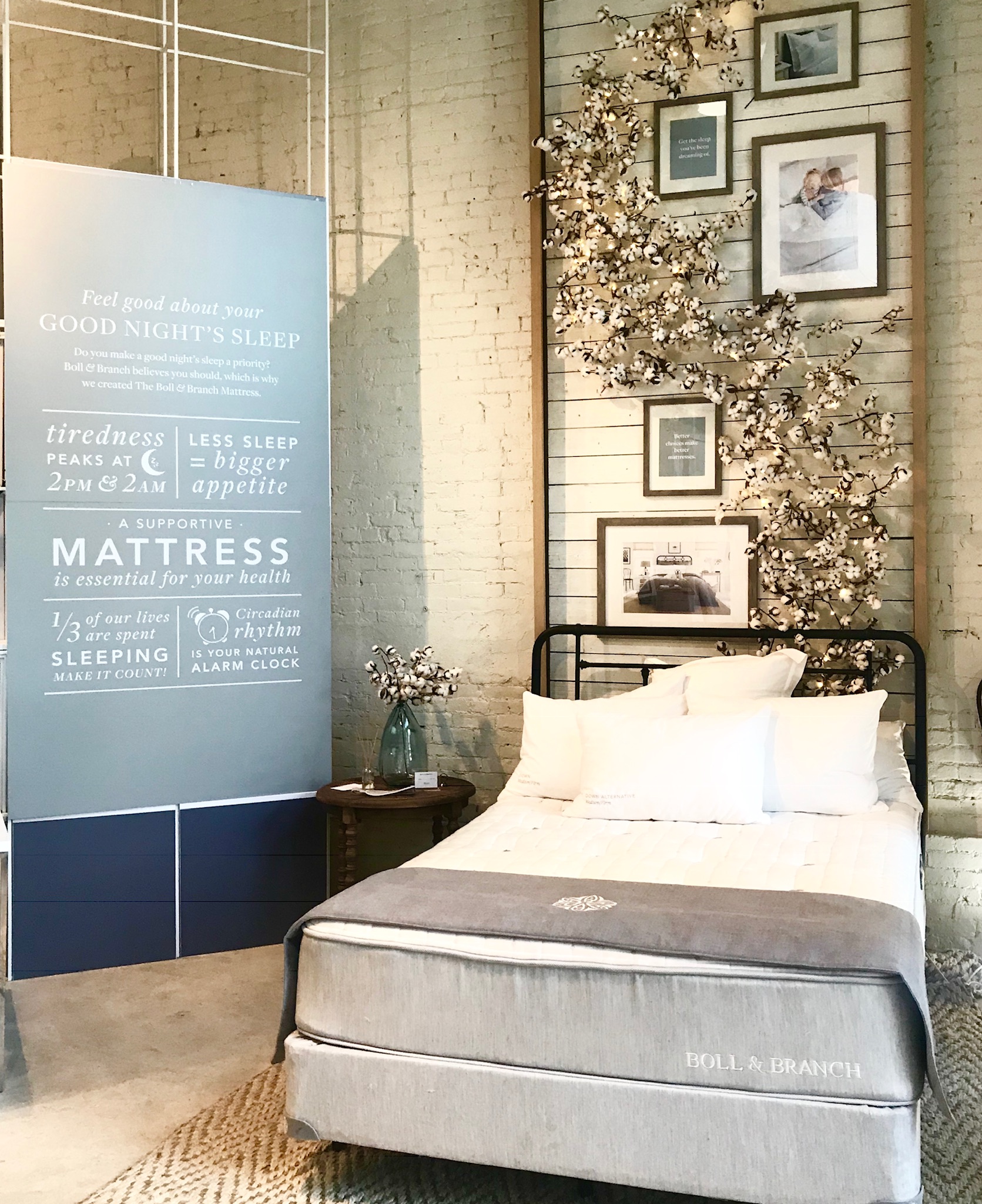
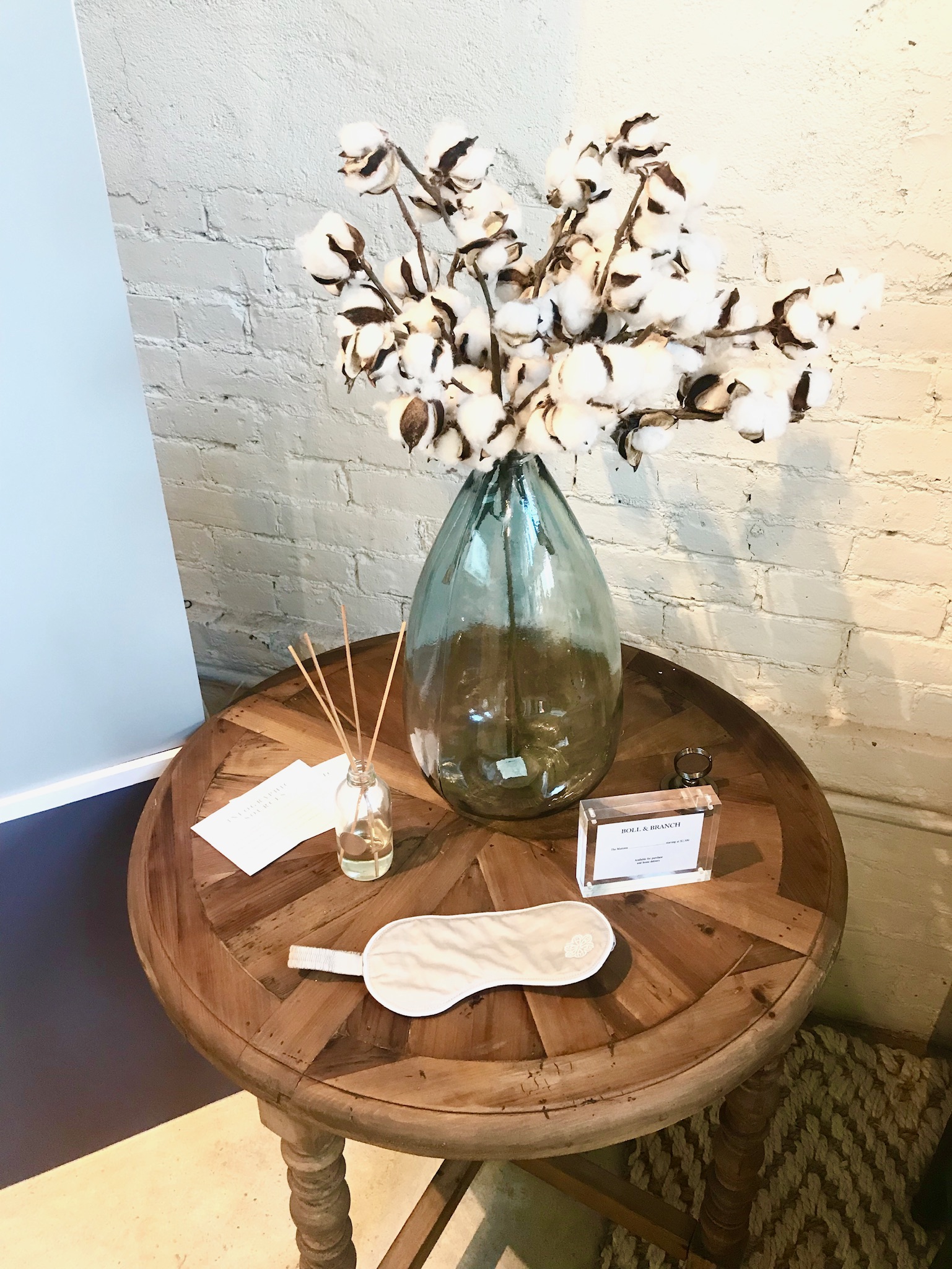
Boll & Branch, a family founded luxury bedding company, focused on upending the industry with well sourced, ethically and organically made materials at a reasonable price. Their space was the most like what’d you see in a conventional mall. While it was well merchandised and the product looked elevated within the space, there was barely any mention of the fair trade ethics that represent the core of the company.
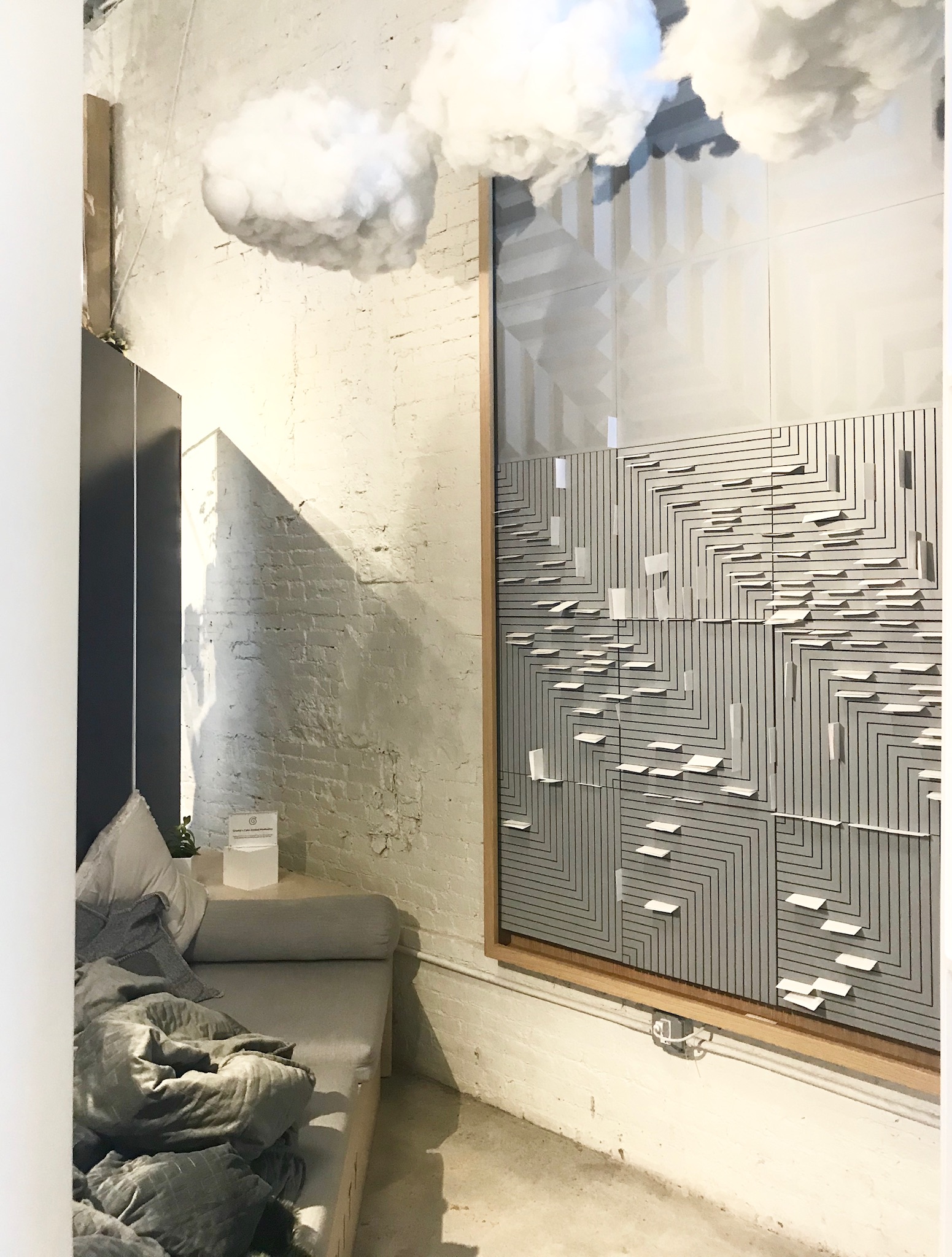
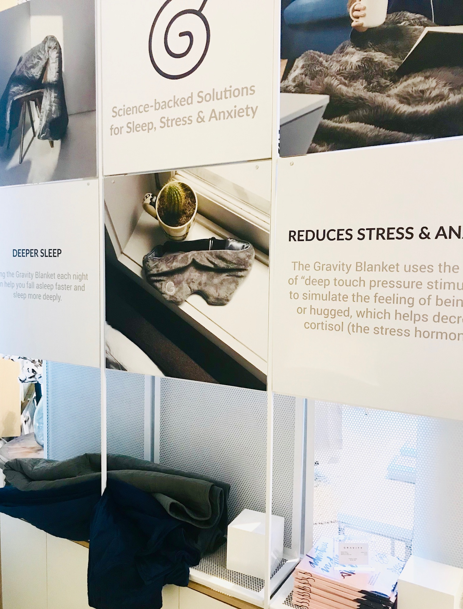
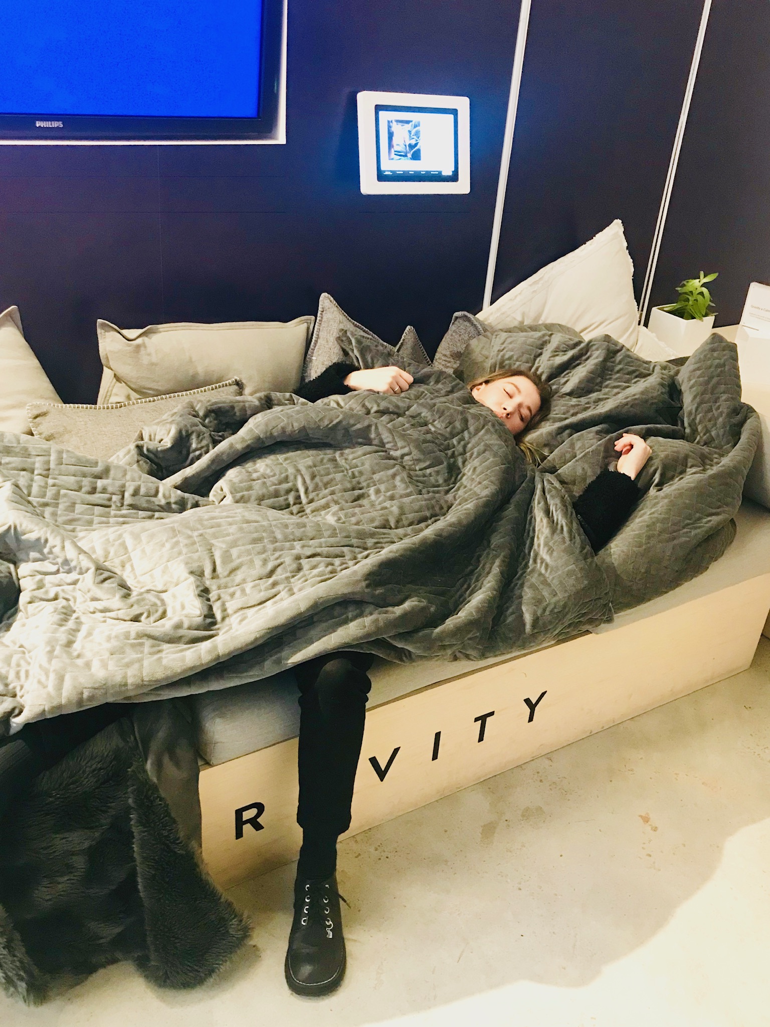
The Gravity blanket company is a prime example of what Boll & Branch’s space was missing. The booth was about half the size of most, with just a small bed doused with their signature products. Gravity blankets weigh 10% of the average person's weight therefore when used naturally relaxes the nervous system raising melatonin/serotonin while decreasing cortisol levels. In the intimate space a customer can not just read but also experience how the science of the blanket, sleep mask and melatonin mist can give you a better physical and mental night sleep. The dimmed lighting, cool neutral colors and fluffy faux clouds instantly transport you into a calm. Gravity understands to let their products speak for themselves in a perfectly curated corner.
After each booth the hallways seamlessly overflow into the next, eventually leading to the by CHLOE. test kitchen , Thrills by CHLOE. The fun house influenced space is a joyful way to exit the mall with a health forward snack.
Once the upper floors open it will be worth another visit to see if Showfields can bridge a gap between physical brick and mortar spaces and co-working lounges - I heard a rumor that there will be a literal slide connecting two floors.
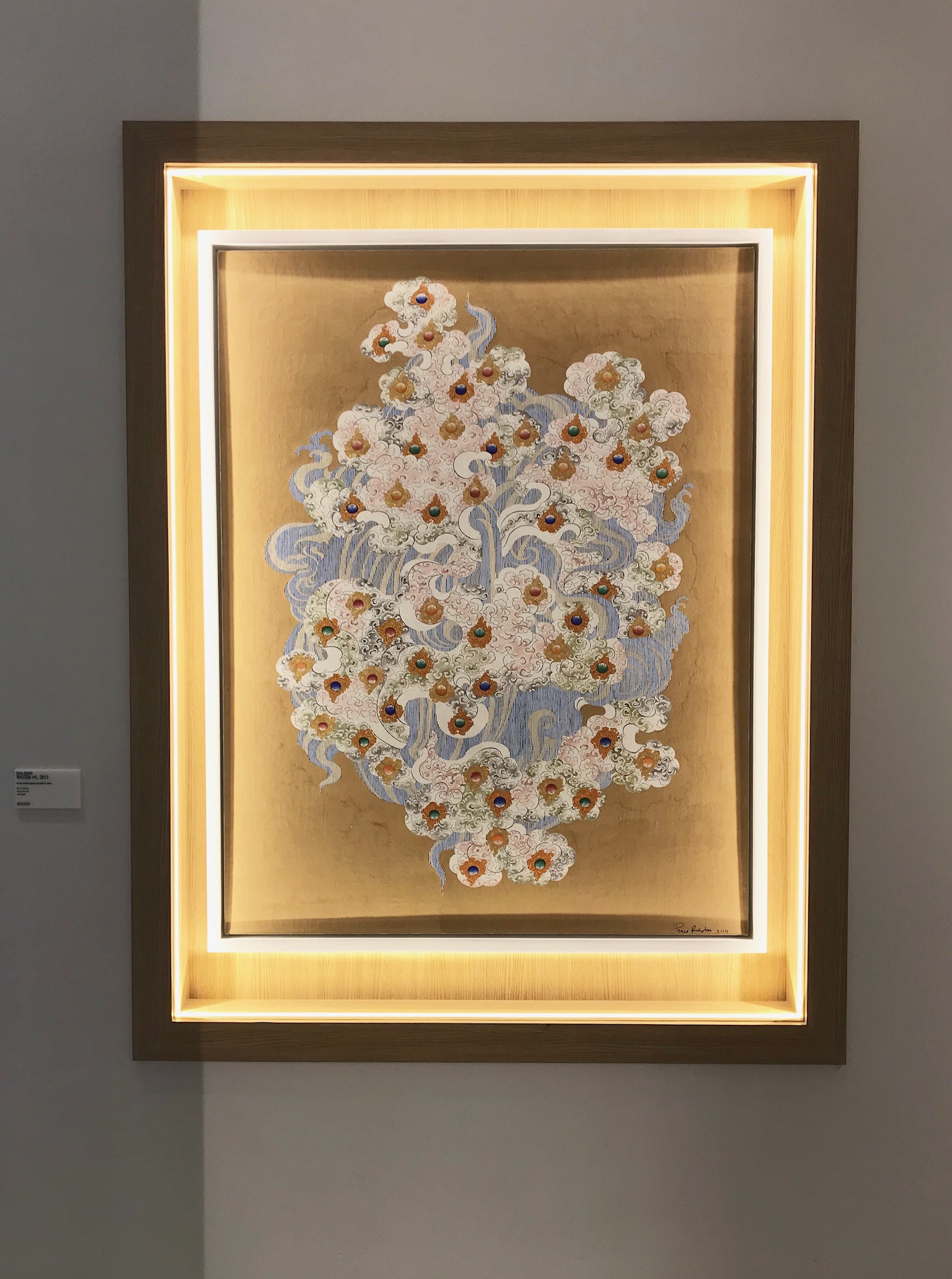
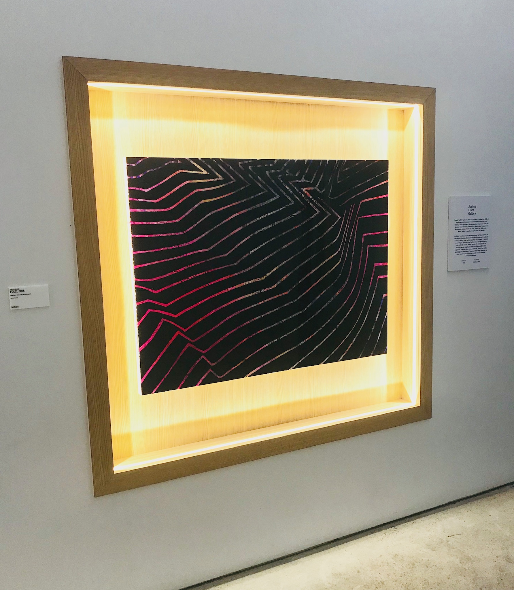
Showfields is a new type of retail concept refreshing the idea of a mall. To create a community of brands and experiences focused on reshaping the world in a positive way, is a lofty goal. Yet, this model of semi-permanent leasing offers not only a space for start-ups but will hopefully create an environment of discovery at Showfields. WIth the ever evolving brands, and art they display intermittently along the halls, each time you experience Showfields they intend that you’ll stumble upon something different - much like scrolling through media.

